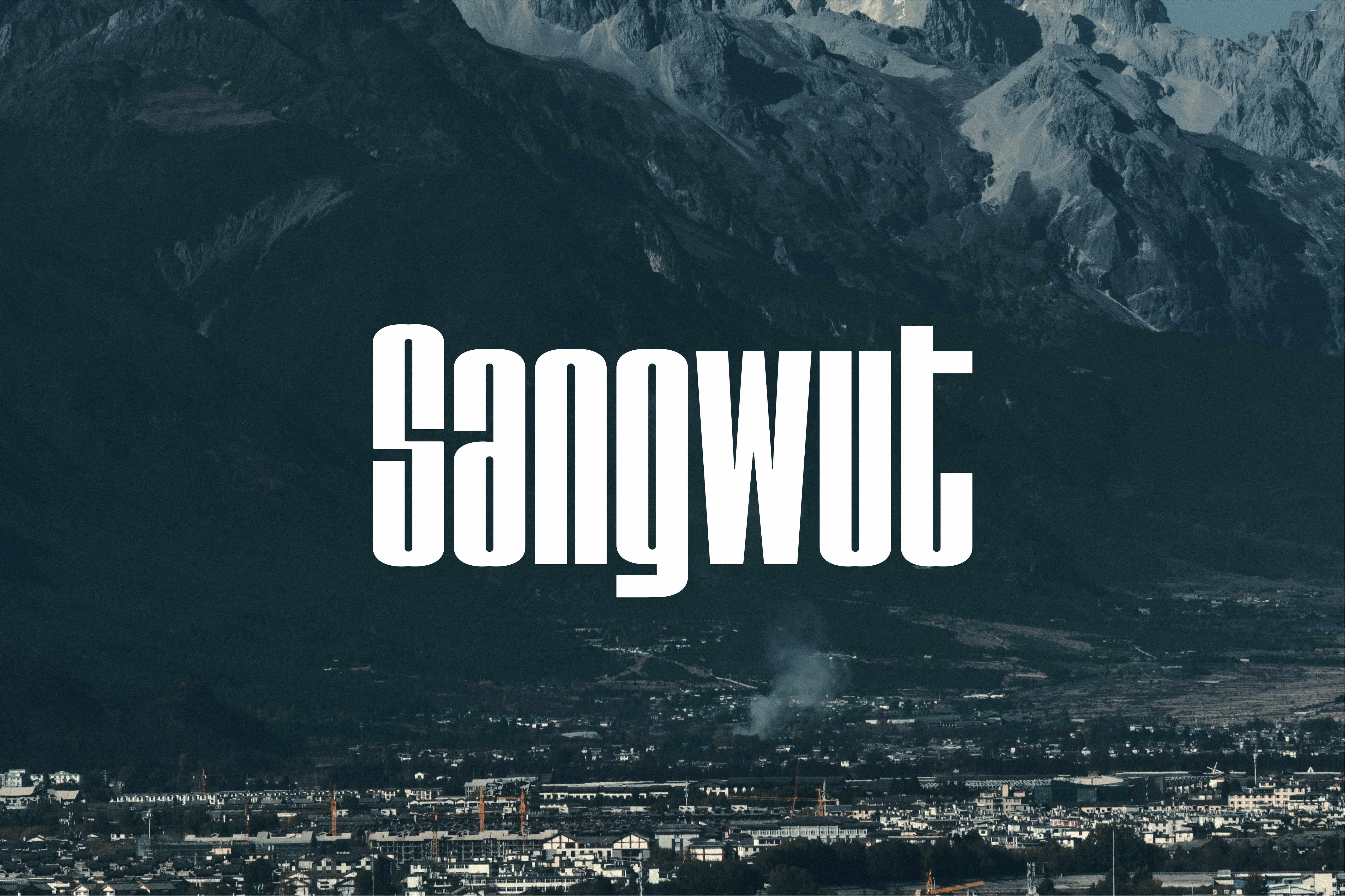


Sangwut
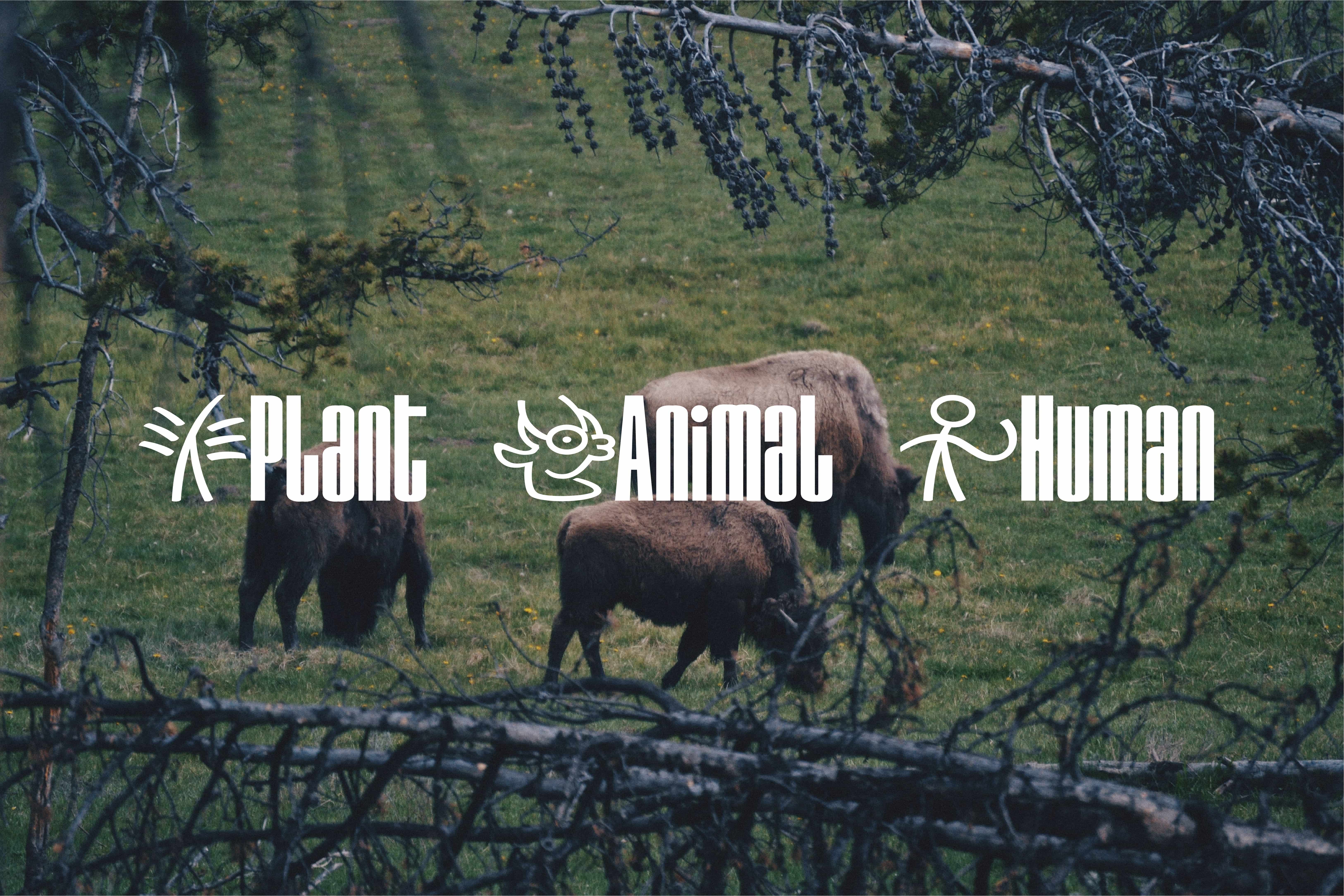
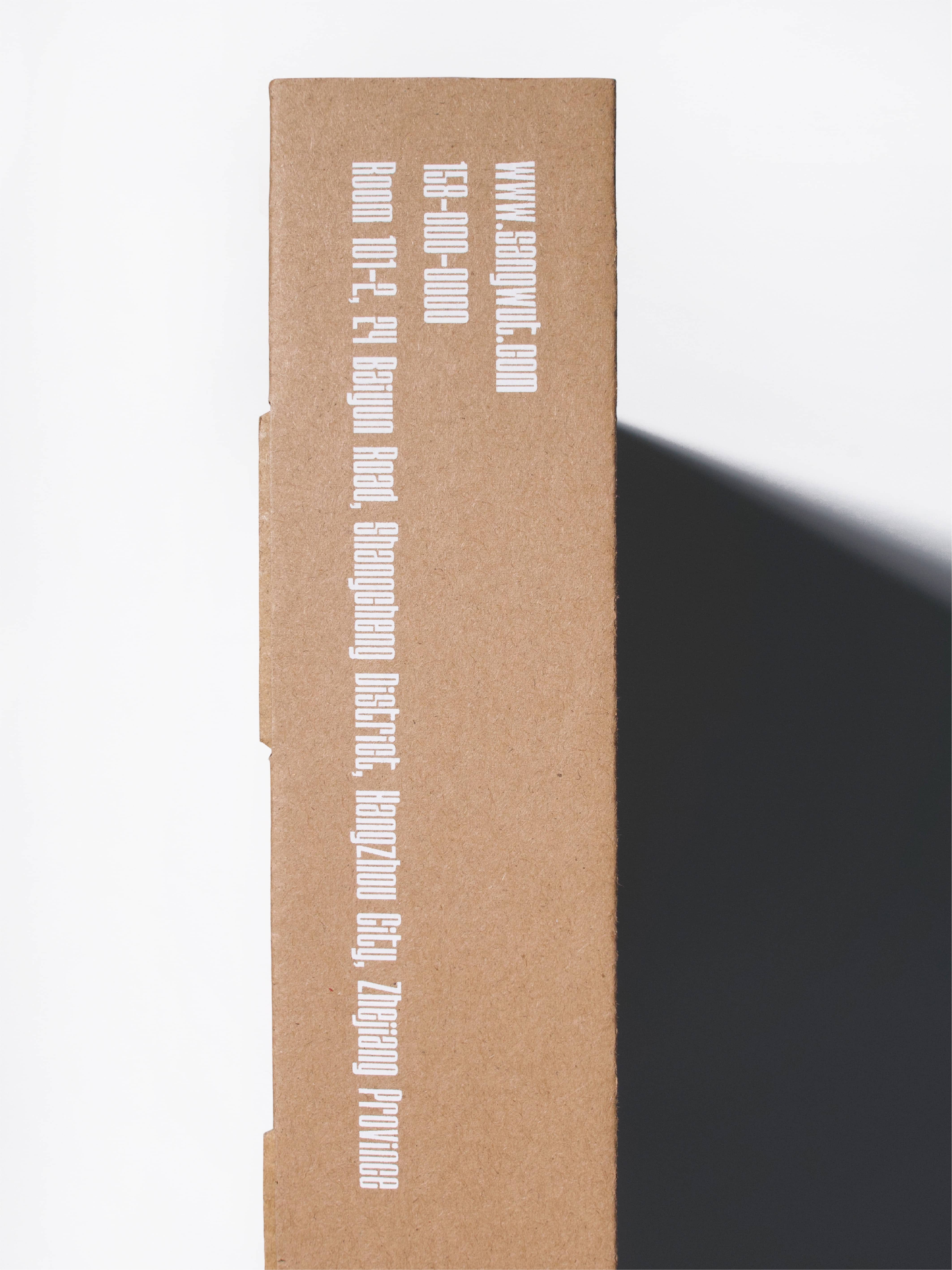
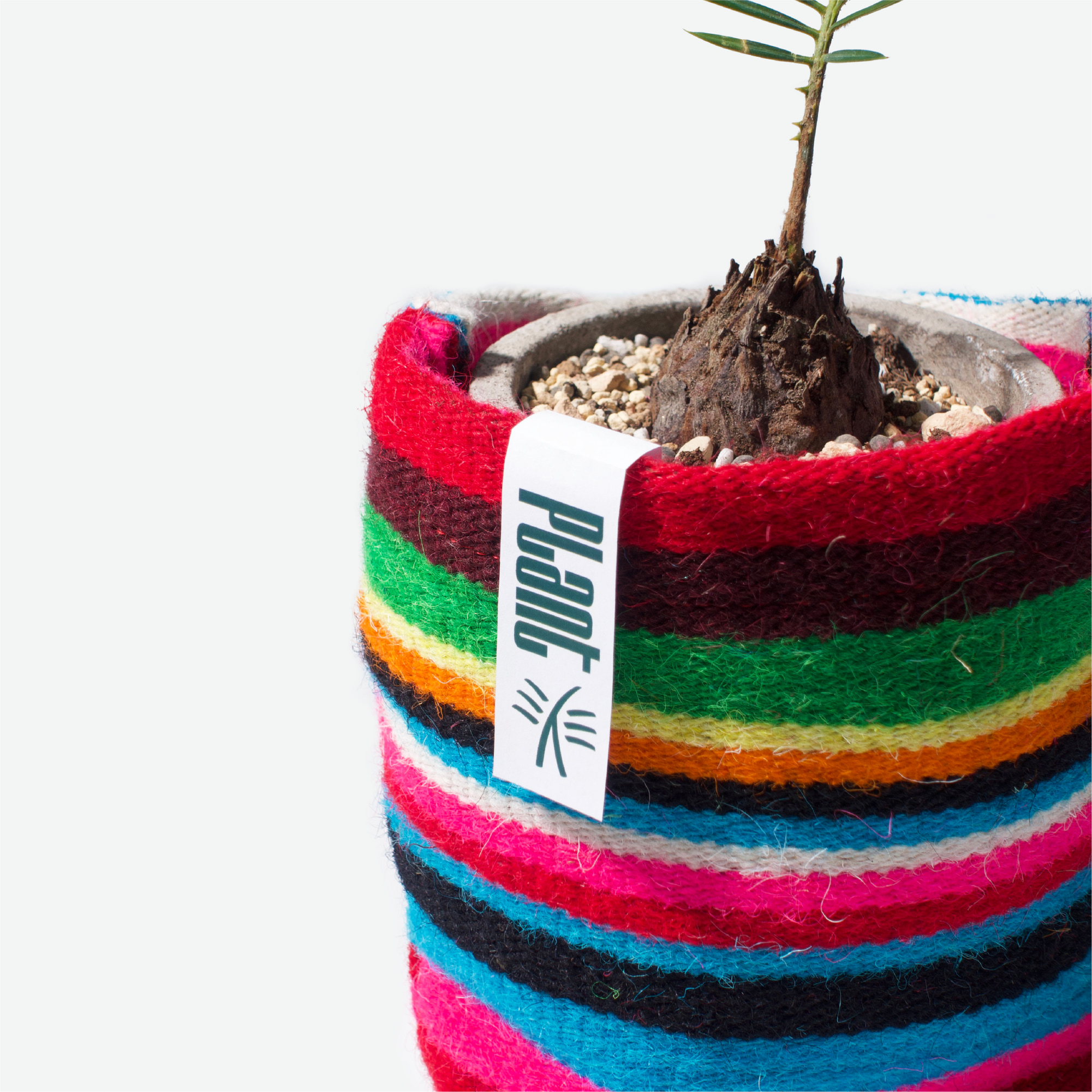
Sangwut希望以中国传统在地文化出发,传递“来自于自然”的品牌理念。Sangwut其发音来自“生·物”,词语本身无意义,可又能延伸至生活、生命,创造等词语。我们设计了一套厚重有力量的西文字体,像一棵棵大树可以构成一座森林。同时以国内尚存在使用的纳西族东巴文字作为图像符号灵感,设计了代表人,动物,植物的三个图像标识,倡导人跟自然、动物的和谐相处。
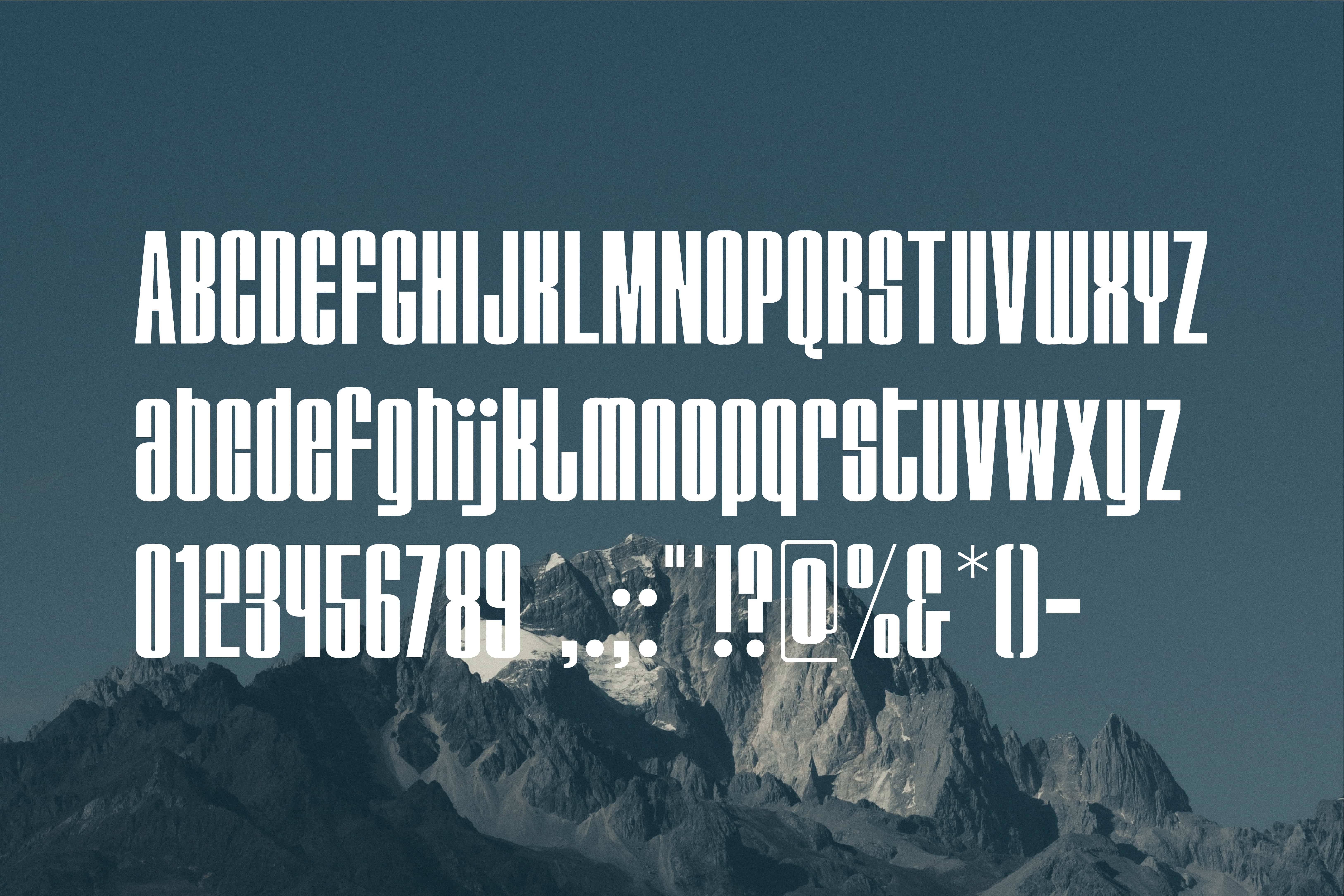
Sangwut aims to convey the brand concept of "originating from nature" based on the traditional Chinese culture. The pronunciation of Sangwut is derived from the word "生(life)·物(matter)" in Chinese, which is meaningless in itself but can be extended to life, lives, creation, etc. We designed a set of heavy and powerful western fonts, symbolizing that big trees can form a forest. We designed three icons of human, animal, plant Inspired by the Naxi Dongba font which is still in use in China, in order to advocate the harmony between human beings, nature and animals.
Year
2022
Client
Sangwut
Team
AD+D 黎俊洋、邓文进
Year
2022
Client
Sangwut
Team
AD+D Jaden Li、Wenjin Deng
©All rights Reserved by Substitus Design